Clearer Messaging
Repositioned the hero around the homeowner’s desired outcome, not just the company’s location and years in business.
PREMIER BASEMENT SYSTEMS · CONCEPT REDESIGN
Premier Basement Systems already had decades of experience, a clear service offering, and strong proof behind its work. The redesign focused on bringing those strengths forward—clarifying the value proposition, simplifying the path to action, and making trust easier to establish before the first call.
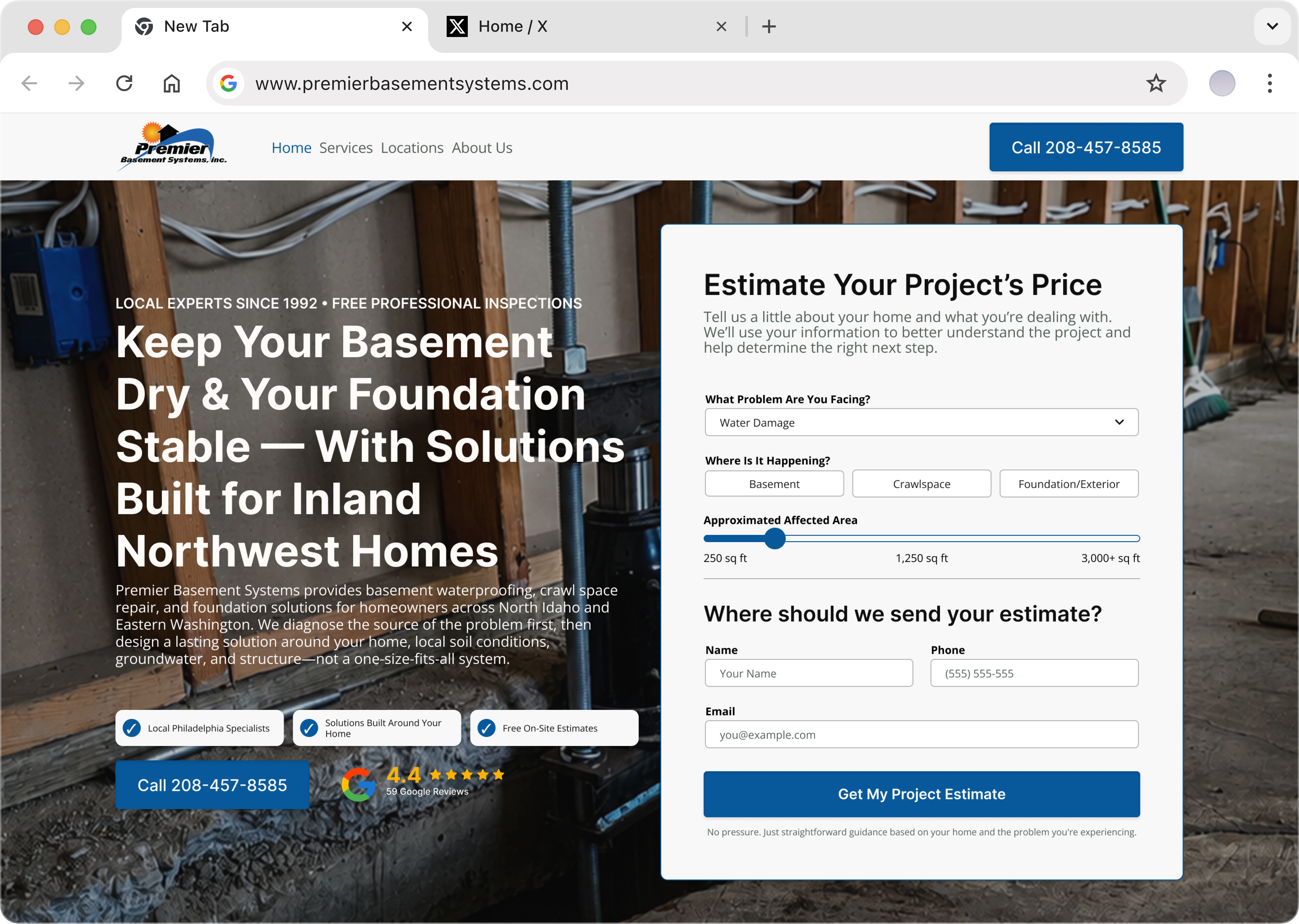
Repositioned the hero around the homeowner’s desired outcome, not just the company’s location and years in business.
Introduced more direct calls to action and simplified benefit presentation to help high-intent visitors act faster.
Brought reviews, trust signals, and existing project proof into the main homepage journey instead of leaving them separated from the decision path.
BEFORE THE REDESIGN
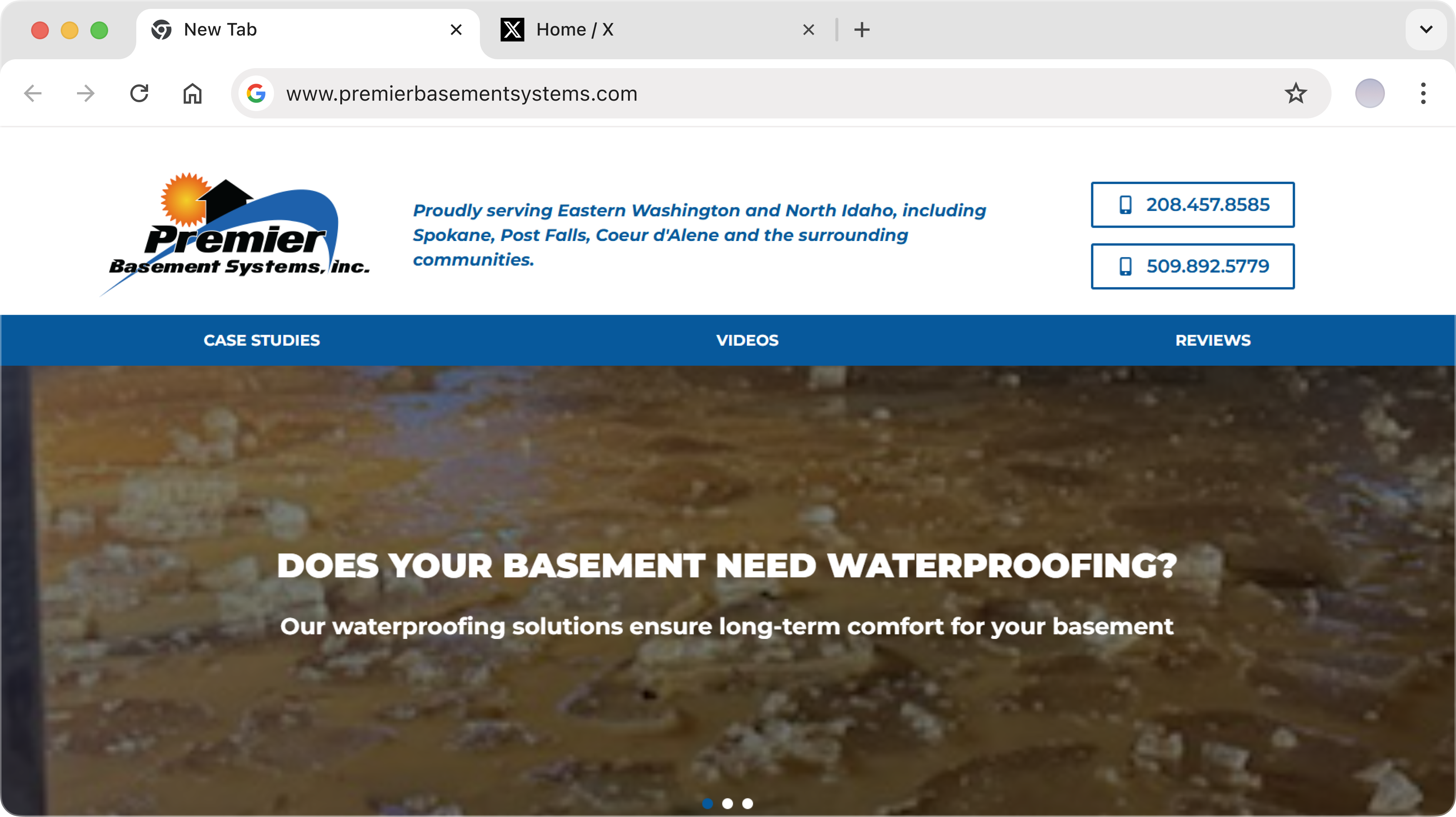
Premier had the experience, proof, and service quality needed to build confidence, but those strengths were not always communicated where they had the most influence. Important information was either buried in longer copy, separated across pages, or missing from the first screen entirely.
messaging
The hero explained what Premier did, where it operated, and how long it had been in business, but gave visitors little sense of what made the company meaningfully different.
Conversion
Key reasons to choose Premier were presented through relatively dense copy, forcing visitors to read closely before understanding the practical value of the service.
TRUST
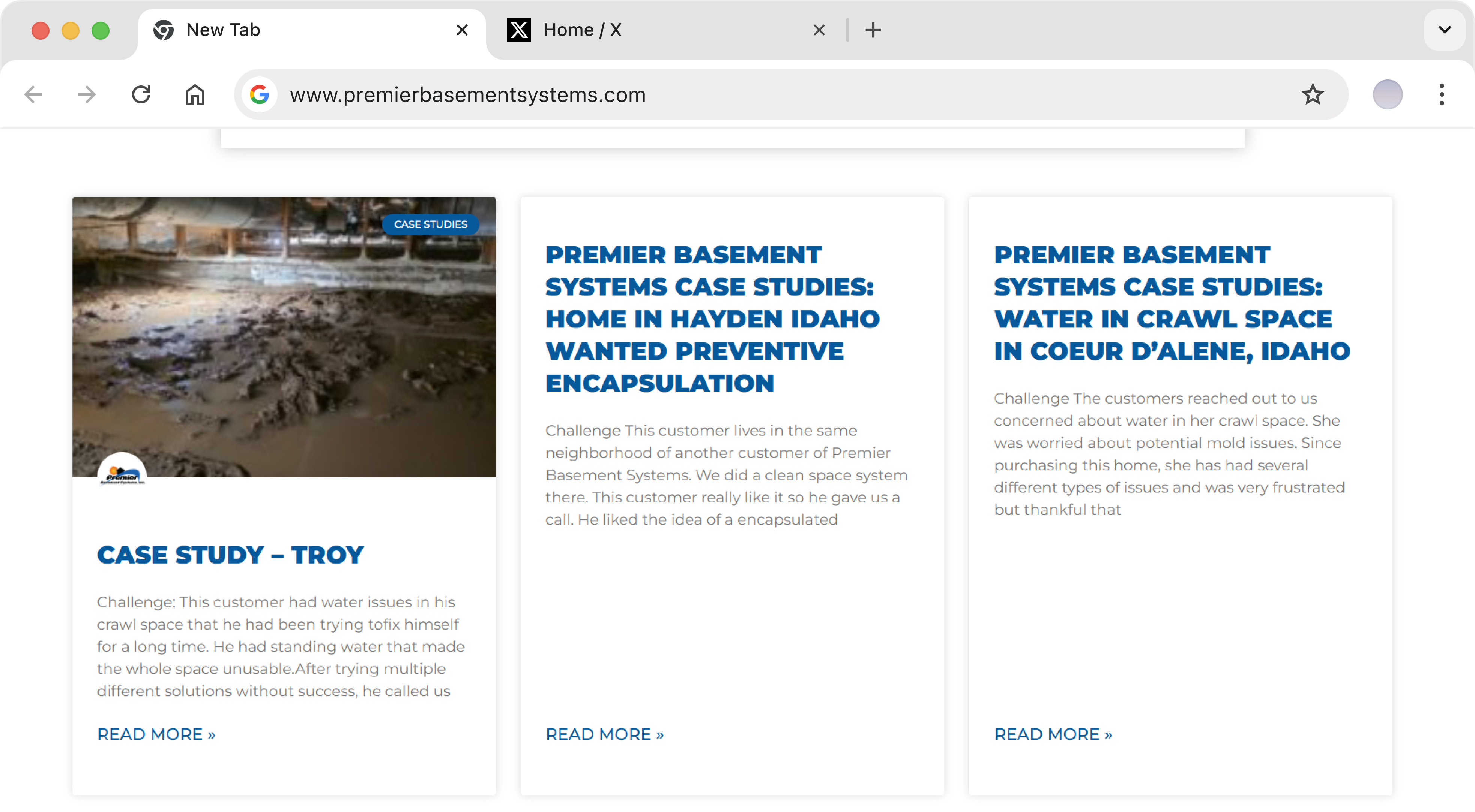
Strong before-and-after work existed, but it lived on a separate page, making visitors take an additional step to see evidence of Premier’s results.
FINDING 01 - MESSAGING
The existing hero led with Premier’s category, geography, and longevity, but did not clearly connect those credentials to a differentiated customer outcome.
Without visible reviews, trust reducers, or a direct in-section CTA, the most important part of the page did less to build confidence and capture immediate intent.
INTERVENTION 01 - MESSAGING
Reworked the value proposition around the homeowner’s desired result while keeping the services and geographic relevance immediately clear.
Added Google review proof and concise trust badges directly into the hero so reassurance appears alongside the primary sales message.
Added a direct call CTA and an estimate form beside the hero, allowing high-intent visitors to convert without searching elsewhere on the page.
FINDING 02 — CONVERSION
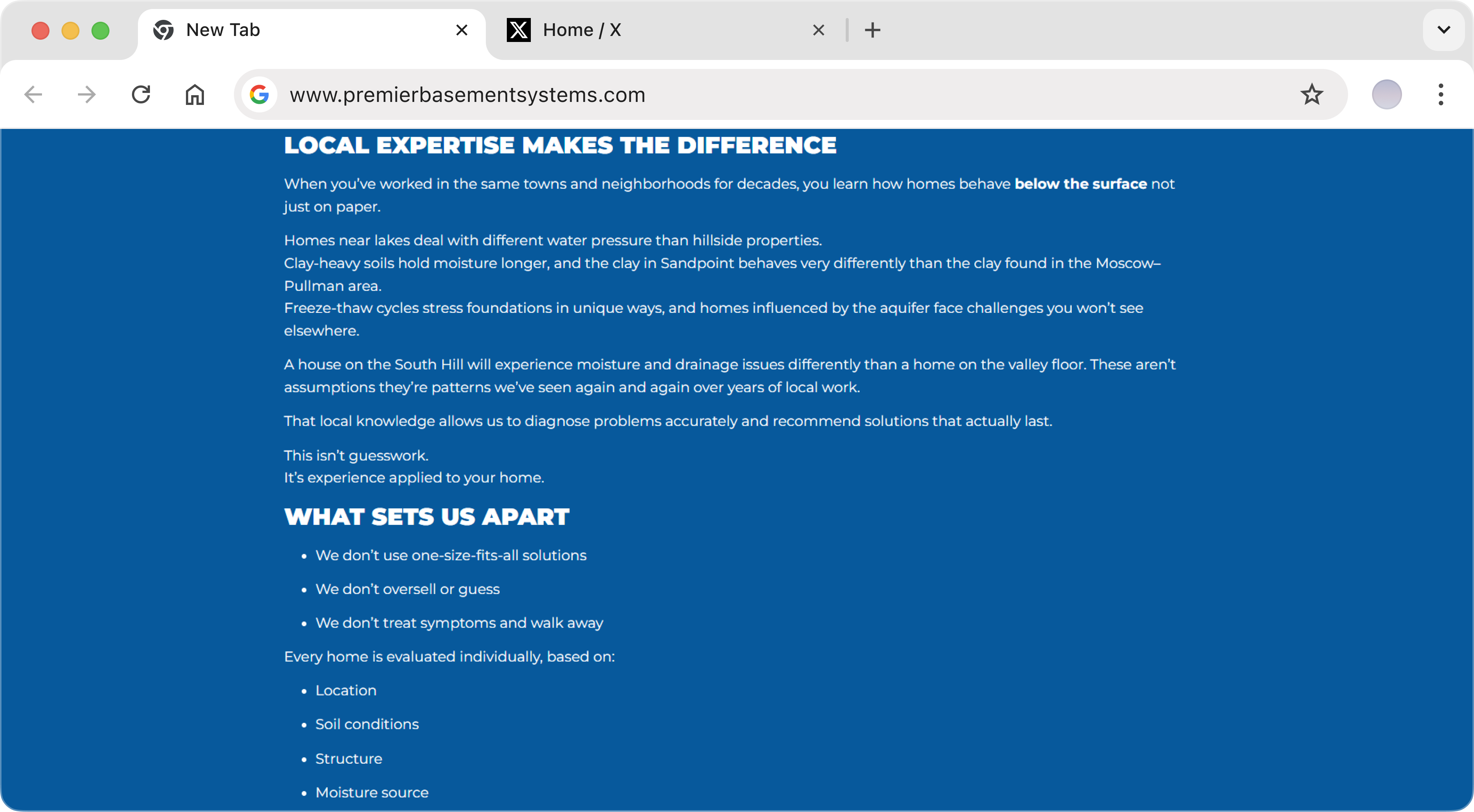
The existing benefits communicated meaningful advantages, but relied heavily on body copy that required visitors to stop and read before grasping the value. Because the section appeared before the services, slow comprehension could weaken momentum before visitors even reached the company’s core offering.
INTERVENTION 02 - TRUST, CLARITY & CONVERSION
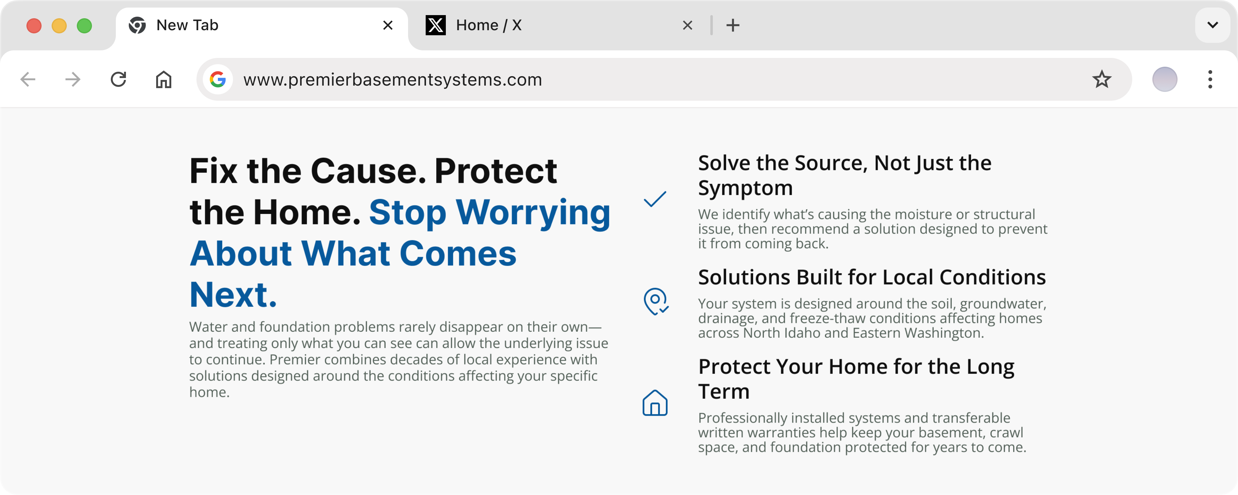
Reorganized the section into clear visual cards, allowing each major benefit to be understood independently at a glance.
Reduced long-form explanation into concise, outcome-driven statements that communicate the value without demanding excessive reading.
Made the most important reasons to choose Premier visually distinct, helping visitors understand the offer faster before moving into the service sections.
FINDING 03 — TRUST
Premier already had a substantial before-and-after library, but that evidence was separated from the main homepage experience.
This created additional friction at the exact point where visual proof could help reduce uncertainty and reinforce confidence in the company’s ability to deliver.
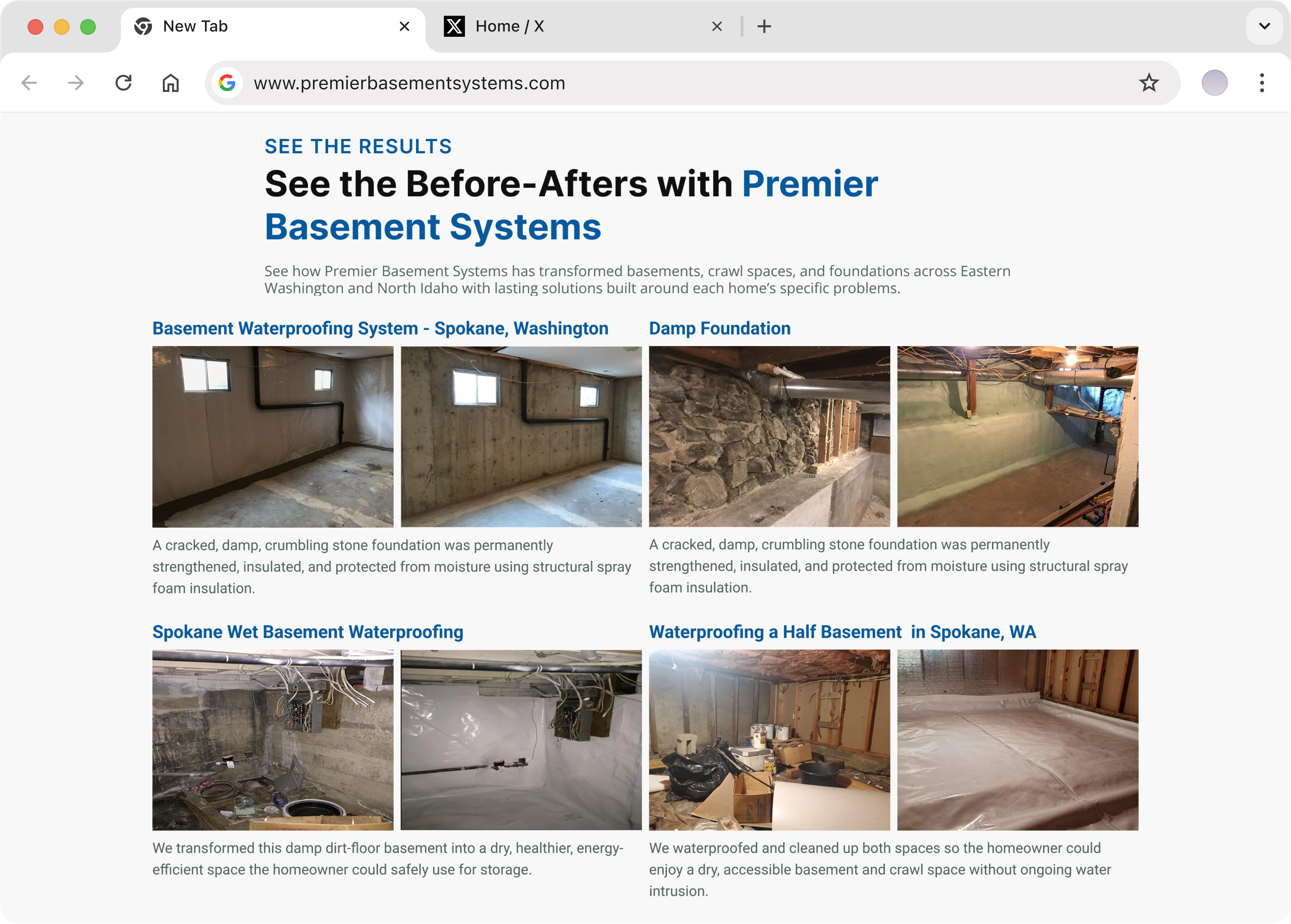
FINDING 03 — TRUST
Introduced a before-after section directly onto the homepage, giving visitors immediate access to completed projects compared to their previous state without requiring another navigation step.
Gave visitors an alternative to calling immediately, making it easier for people who want pricing context before speaking with a contractor.
Collected the customer’s contact information alongside project details, giving the sales team a more useful starting point for qualification and follow-up.
A CLEARER PATH TO CONVERSION
The redesign did not attempt to reinvent Premier’s service offering; it focused on making the company’s existing strengths easier to understand, trust, and act on. By improving the hero, simplifying the benefits, and surfacing project proof earlier, the homepage became a more complete sales experience for high-intent homeowners.
messaging
Visitors can now understand what Premier does, what outcome it delivers, why the company is credible, and how to take the next step from the opening section.
Conversion
A simplified benefits section makes the primary reasons to choose Premier easier to scan, helping visitors grasp the value without working through dense copy.
TRUST
Bringing before-and-after work onto the homepage gives prospective customers direct evidence of completed projects before they are asked to convert.
This redesign was developed as a strategic portfolio exercise and was not launched by Premier Basement Solutions. These outcomes describe improvements delivered by the proposed experience and architecture, not measured post-launch performance.
APPLY THE SAME THINKING
If your business already has the experience, proof, and service quality customers are looking for, your website should make those strengths impossible to miss. East Orion redesigns local-service websites around clearer positioning, stronger trust, and conversion paths built to turn more high-intent visitors into leads.