Clarified the Message
Repositioned the hero around what Rimrock does, where it works, and the complete outdoor result customers can expect.
RIMROCK LANDSCAPE · CONCEPT REDESIGN
Rimrock Landscapes already offered the breadth of services needed to take outdoor projects from groundwork to completion, but its homepage did not communicate that value as clearly as it could. We redesigned the experience around sharper positioning, easier service discovery, and stronger proof to help prospective customers understand, trust, and act on the offer.
Repositioned the hero around what Rimrock does, where it works, and the complete outdoor result customers can expect.
Rebuilt the service experience so visitors can quickly compare Rimrock’s major capabilities and quickly identify the right next step.
Brought reviews, testimonials, and completed projects into the homepage to support Rimrock’s claims with visible evidence.
BEFORE THE REDESIGN
Rimrock had the services and project experience to handle substantial outdoor transformations, but the homepage made visitors work to understand why the company was different. Broad messaging, friction in allowing a visitor to convert, passive service discovery, and limited visible proof weakened the path from first impression to confident inquiry.
messaging
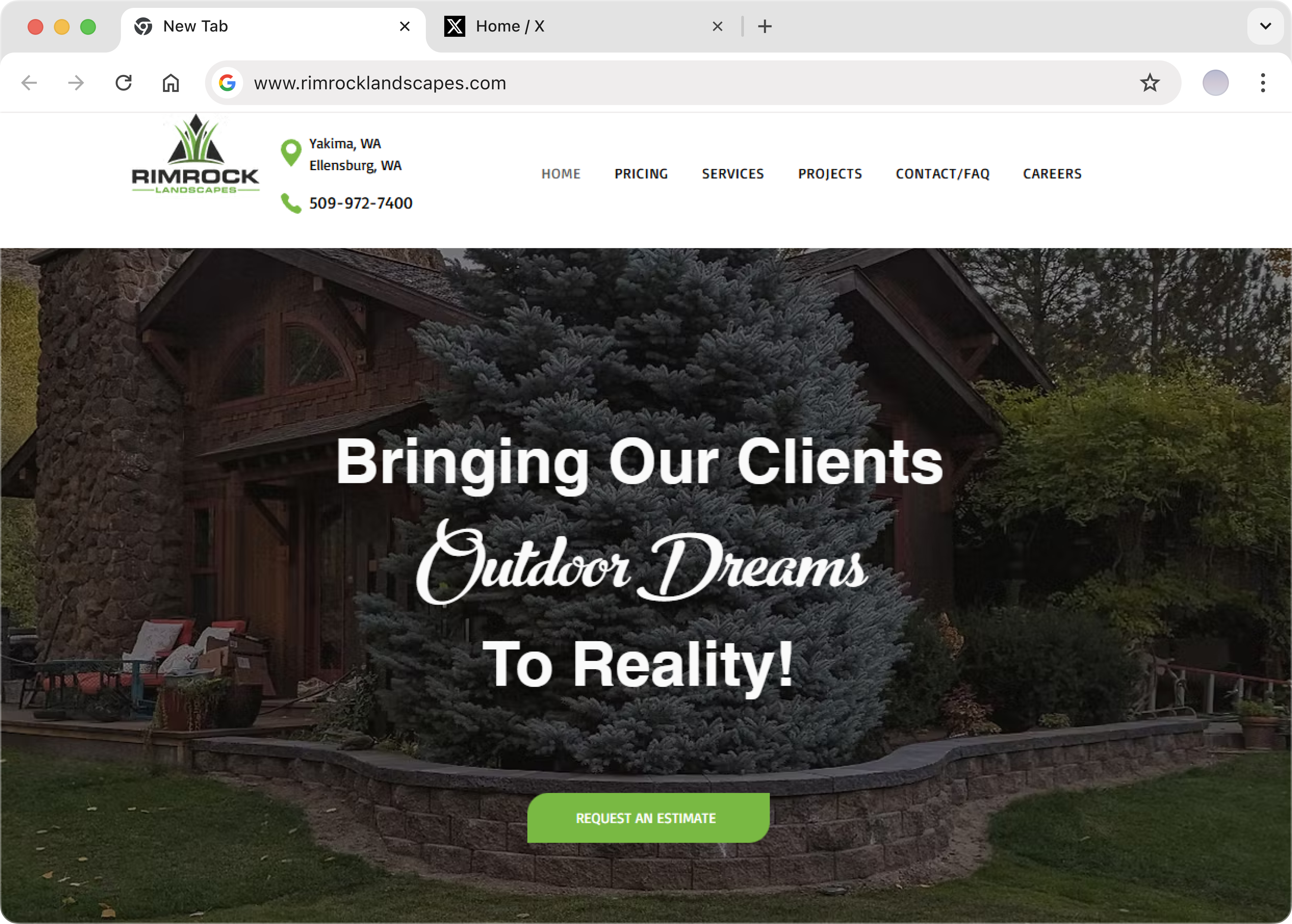
“Bringing Our Clients Outdoor Dreams To Reality!” communicated aspiration, but not Rimrock’s service scope, geographic relevance, or start-to-finish capability.
Conversion
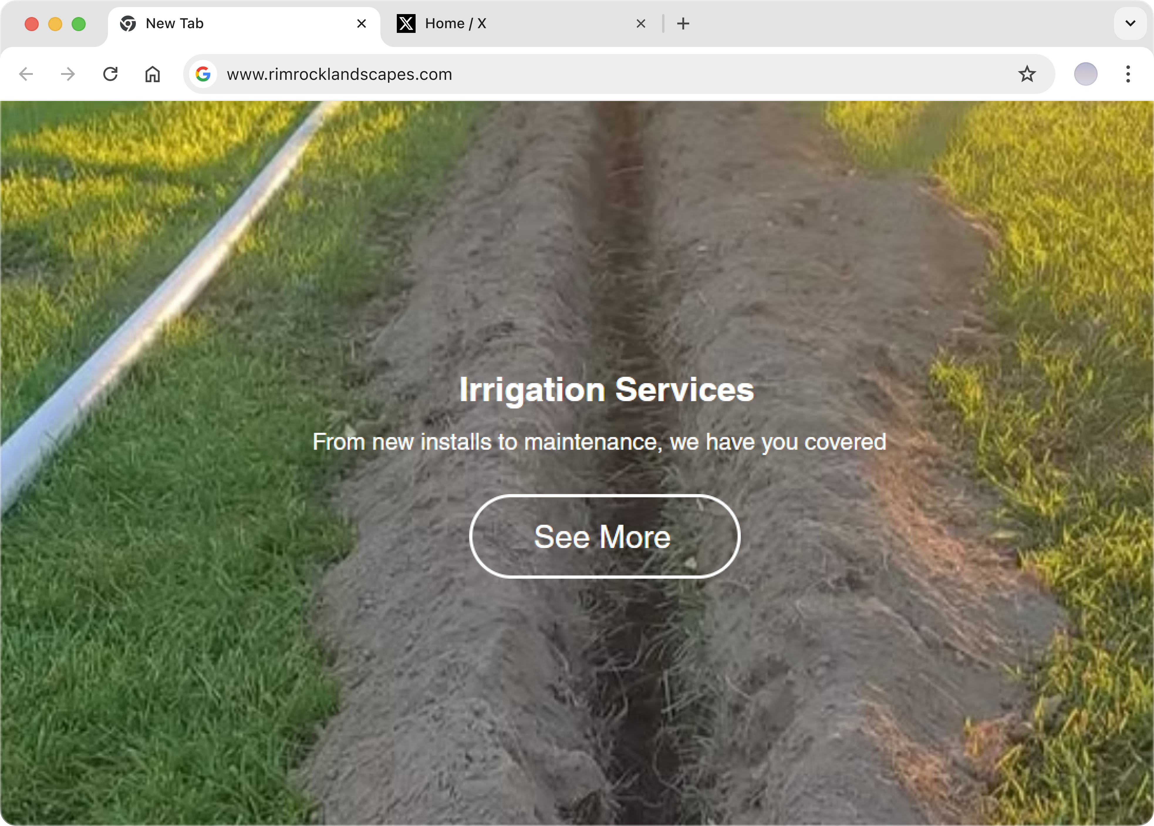
A carousel required visitors to browse services individually, instead of all being presented, while largely informational CTAs gave them little momentum toward discussing a project.
FRICTION
Visitors ready to explore pricing or project fit had no simple way to provide project details without making a call, creating unnecessary friction at a critical point in the buying journey.
TRUST
Without prominent reviews, testimonials, or completed work, prospective customers had limited evidence to validate Rimrock before making contact.
FINDING 01 - MESSAGING
The existing hero promised to bring customers’ outdoor dreams to reality, but it did not immediately establish what Rimrock provided, where it operated, or what made its approach distinctive.
That ambiguity could force new visitors to explore further before even determining whether the company was relevant to their landscaping project, or even if it was the best fit for it.
INTERVENTION 01 - MESSAGING
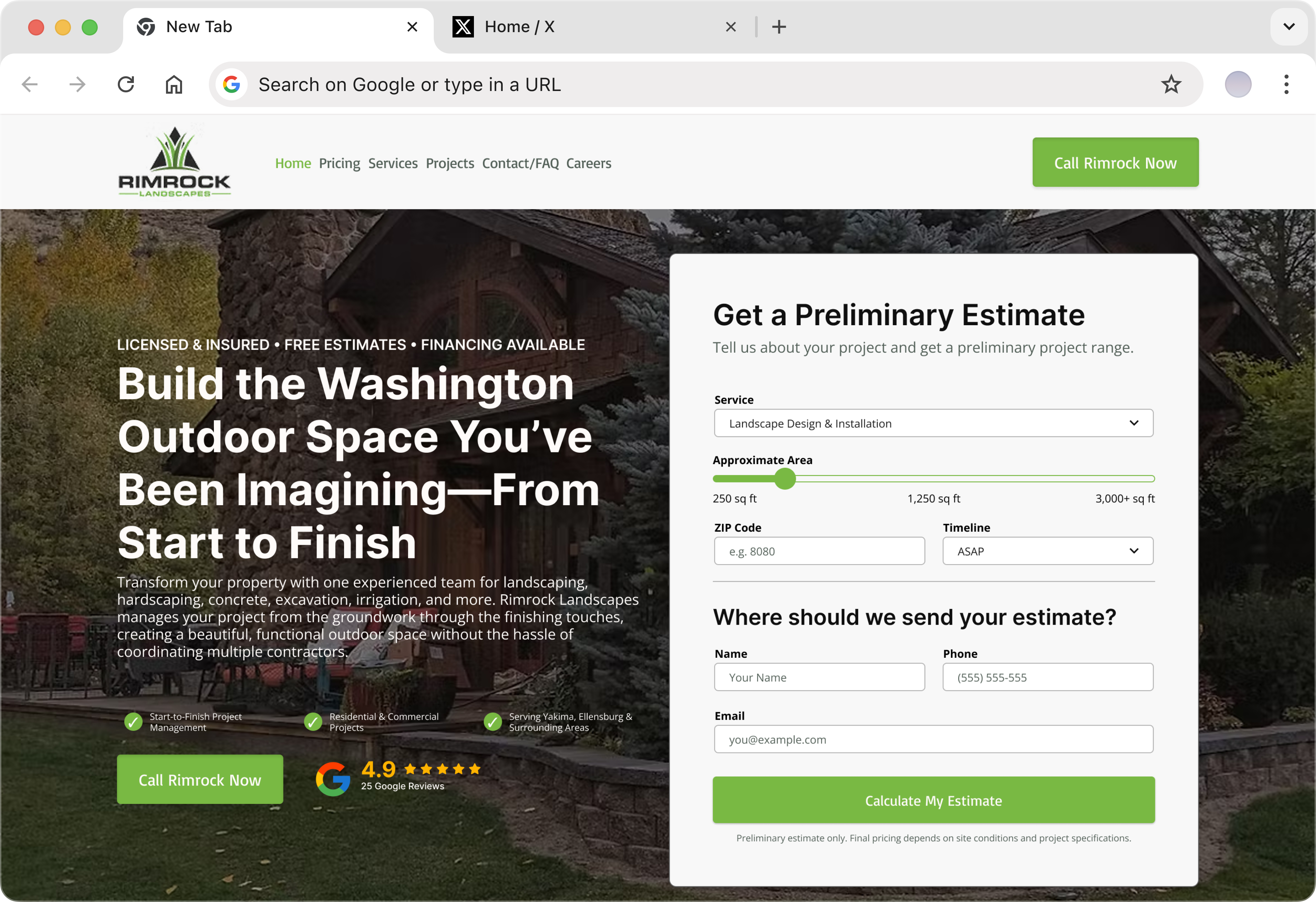
Reframed the hero around building complete outdoor spaces, immediately giving visitors a clearer understanding of what Rimrock helps them accomplish.
Integrated Washington into the value proposition so local prospects could recognize the business as relevant from the first headline.
Emphasized Rimrock’s ability to manage projects from groundwork through completion, turning its breadth of services into a meaningful customer benefit.
FINDING 02 — CONVERSION
The existing carousel presented services one at a time and relied on low-intent, informational calls to action rather than helping visitors quickly compare their options. This introduced unnecessary interaction and reduced the opportunity to connect individual services directly with the outcomes customers were seeking.
Additionally, the services failed to present the dream outcome, or the benefits of the service to the visitor, increasing the chance that Rimrock would be compared based on its price - not the quality of its service.
INTERVENTION 02 - TRUST, CLARITY & CONVERSION
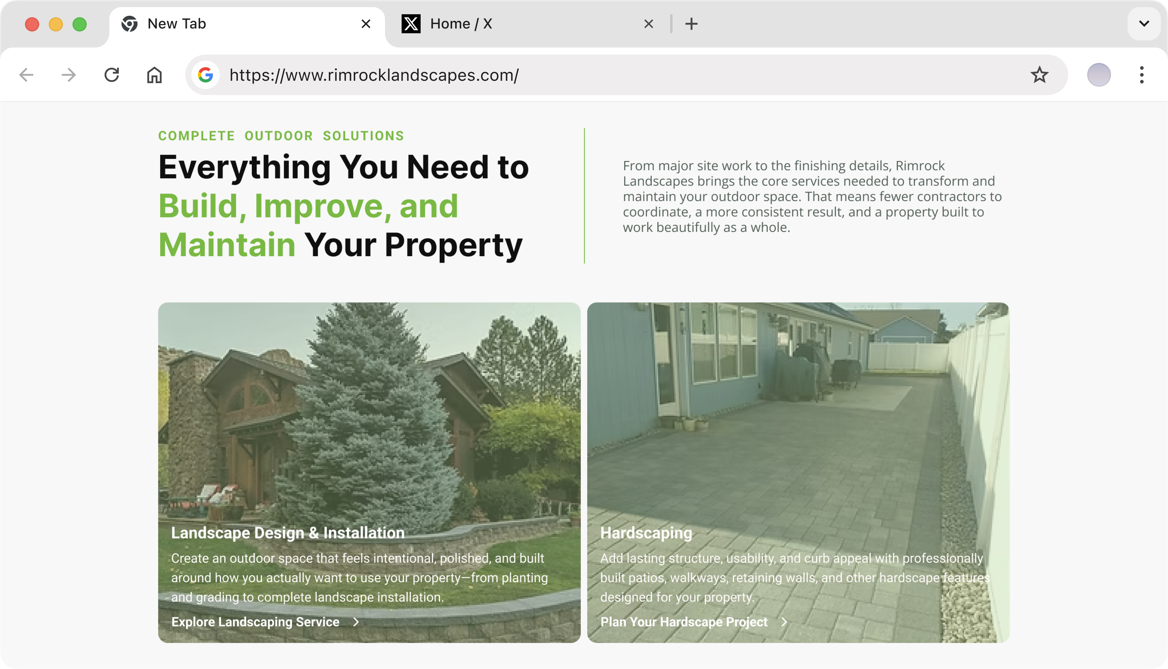
Replaced sequential carousel browsing with a section that presents Rimrock’s major capabilities together, making the offer easier to understand at a glance.
Shifted the copy from simply describing tasks toward the practical outcomes each service creates, including stronger curb appeal, functionality, durability, and usability.
Matched each service with a more specific CTA so visitors could move naturally from identifying a need to exploring or discussing that particular project.
FINDING 03 — CONVERSION PATH
The homepage did not provide an immediate way for visitors to describe their project, size, location, or timeline before reaching out.
This left users who were already interested with a relatively high-friction next step: browse further or initiate a call without first knowing whether the project was a fit.
FINDING 03 — CONVERSION PATH
Added service, project size, ZIP code, and timeline inputs so Rimrock can understand the basic scope of an inquiry before follow-up.
Gave visitors an alternative to calling immediately, making it easier for people who want pricing context before speaking with a contractor.
Collected the customer’s contact information alongside project details, giving the sales team a more useful starting point for qualification and follow-up.
FINDING 04 — TRUST
Rimrock’s homepage contained little visible proof of customer satisfaction or completed project quality. For a high-consideration landscaping purchase, that left prospective customers with fewer reasons to feel confident before making contact.
Reviews and testimonials were not meaningfully surfaced on the homepage, limiting the amount of third-party reassurance available during the buying journey.
The homepage lacked an extensive project gallery, making it harder for visitors to visually assess the quality, scope, and style of Rimrock’s finished work.
INTERVENTION 04 — SOCIAL PROOF
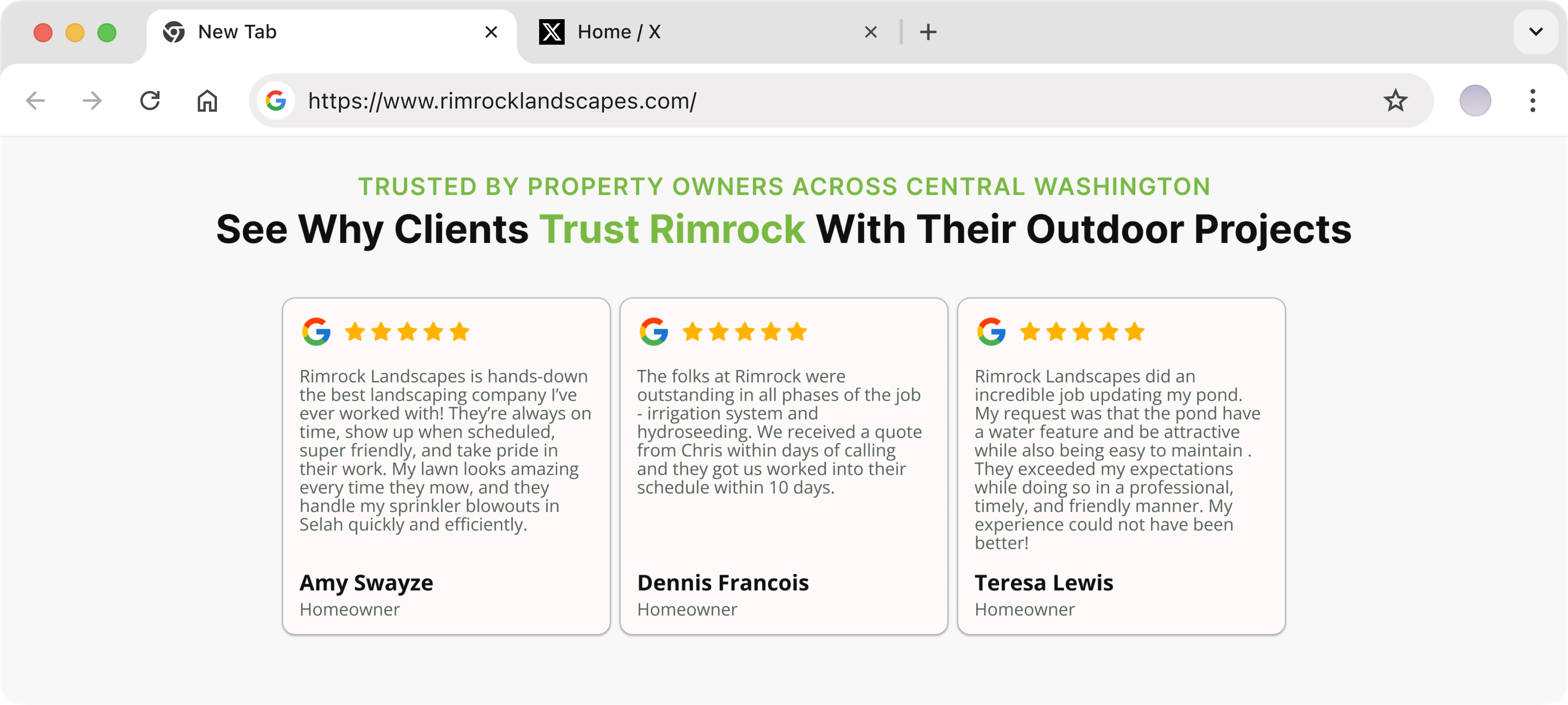
Introduced prominent review proof so visitors could immediately see that previous customers had publicly validated the business.
Created a testimonial section that gives prospective customers direct insight into the experiences of people who had already worked with Rimrock.
Placed social proof within the main homepage journey so reassurance appears before visitors are asked to make a higher-commitment inquiry.
INTERVENTION 02 - TRUST, CLARITY & CONVERSION
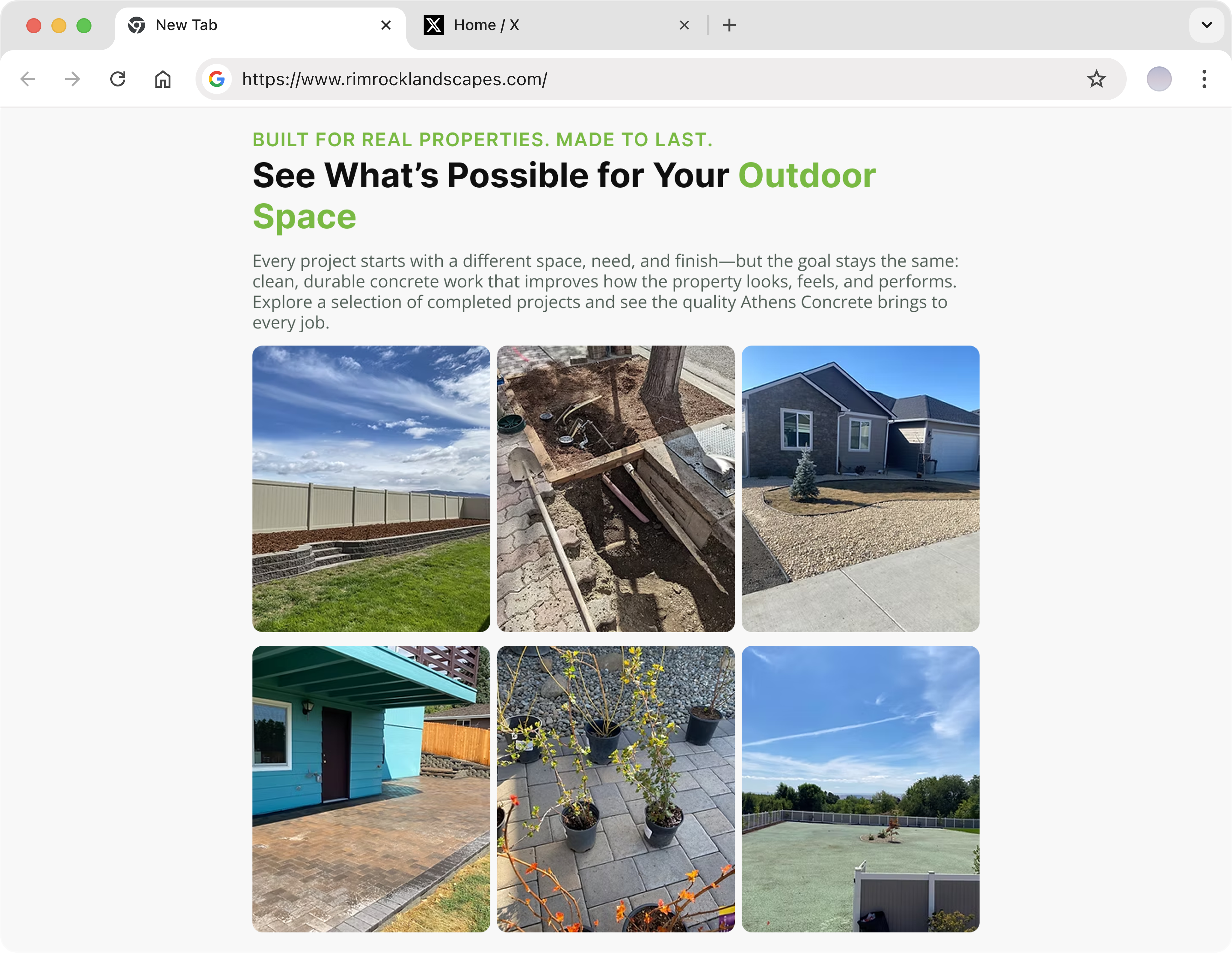
Created a dedicated gallery that allows visitors to see completed landscaping, hardscaping, concrete, and site-work projects directly on the homepage.
Used finished projects as tangible evidence of Rimrock’s workmanship, helping visitors judge the company through real outcomes rather than claims alone.
Positioned project imagery alongside the broader sales journey so visitors could see what Rimrock’s capabilities look like when applied to actual properties.
THE OUTCOME
The redesign does not depend on unverified claims of increased leads; instead, it creates a stronger conversion foundation by making Rimrock easier to understand, evaluate, and trust. Visitors now encounter a clearer offer, more direct service pathways, and stronger evidence before being asked to take the next step.
messaging
Visitors can identify what Rimrock does, where it operates, and why its start-to-finish capabilities matter without needing to interpret a broad brand statement.
Conversion
A benefit-led service section and contextual CTAs reduce browsing friction and give prospective customers clearer routes toward the service relevant to their project.
FRICTION
The estimate calculator gives high-intent visitors a faster way to share their project scope and contact details, creating a clearer path from interest to qualified inquiry.
TRUST
Reviews, testimonials, trust signals, and completed work give visitors multiple forms of reassurance throughout the homepage rather than asking them to trust the company on claims alone.
This redesign was developed as a strategic portfolio exercise and was not launched by Rimrock Landscapes. These outcomes describe improvements delivered by the proposed experience and architecture, not measured post-launch performance.
APPLY THE SAME THINKING
We design websites that turn strong services into stronger sales arguments—clarifying the offer, showing the proof, and making the next step easier for the right customers.